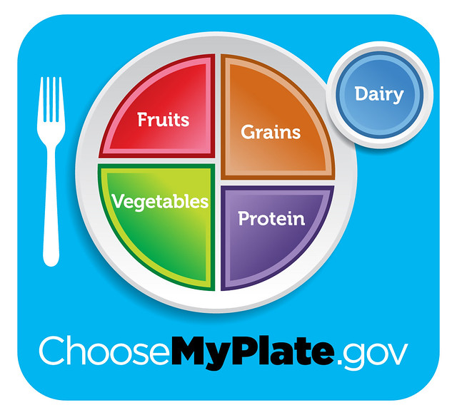
Now Harvard has one-upped the USDA. They have put their own spin on the USDA's graphic and made it much better. Though not totally plant-based, if you read the descriptions carefully you'll see that they're playing up the good stuff and playing down the bad rather than catering to the meat and dairy industry like the USDA is required to do.
Here's the USDA graphic:
And here's how the Harvard School of Public Health tweaked it:
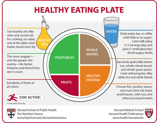
This is even better in some ways than the PCRM graphic, since Harvard has made the veggie quadrant much larger than the fruit quadrant (less sugar is better). And note the addition of the word "Healthy" to the protein quadrant, and the replacement of "dairy" with "water." The Harvard plate would be even better if processed oils were excluded (upper left).
It's amazing how widespread the focus on healthy eating has become, which is a good thing.


No comments:
Post a Comment