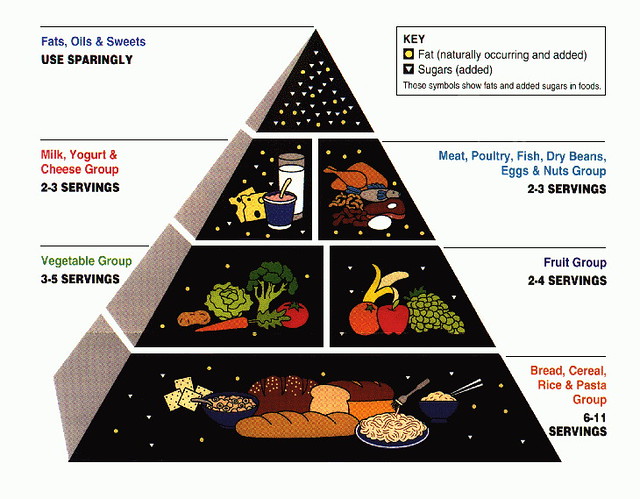
This is the original "food pyramid" issued in 1992:
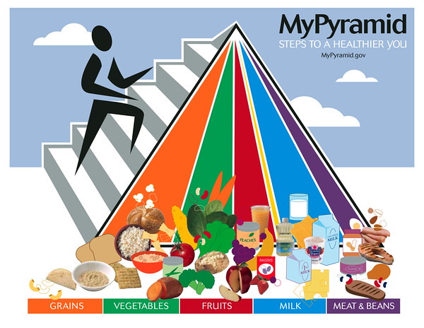
A backward step was taken in 2005 -- an image that communicated nothing but confusion:
The upgrade released a few weeks ago is the best yet:

But notice a couple of things about the image above:
1. The inclusion of "protein" as a food group. Protein is not a food; it's a nutrient that is found in the other three foods (mostly in grains, then veggies, very little in fruit). In other words, it you eat lots of a variety of veggies and grains (and legumes -- see below), you'll get all the protein you need. There is no need to put it as a fourth food group on the plate. Guess why they did? An obvious favor to the hugely influential farmed-meat industry. At least they didn't use the word "meat," but they didn't need to include the protein quadrant at all. If anything, they could have devoted it to "nuts, seeds, and legumes" which are protein dense foods. But the USDA wouldn't dare risk offending the meat lobby by not giving it its own place on the plate.
2. Same for "dairy" in the small glass or bowl to the side -- an obvious encouragement to consume milk and dairy products daily -- the throwing of another bone, this time to the "Got Milk?" folks that own Washington. How silly and unnatural for a human to gather his nutritional inputs from the plant kingdom that grows abundantly around him, then suddenly say, "Wait -- let's go over and drive that calf away from its mother and squeeze the cow's mammary fluid into a glass to wash down our vegetables, fruits, and grains." Who thinks of this?
Removing the protein quadrant and the milk/dairy glass, and adding "nuts, seeds, and legumes" to the fourth quadrant would have made this a truly healthy nutritional graphic.
3. But here's the real irony. Compare the plate image above -- the amount of room taken up on the plate by veggies and fruit -- with the graph below that shows federal food production subsidies.
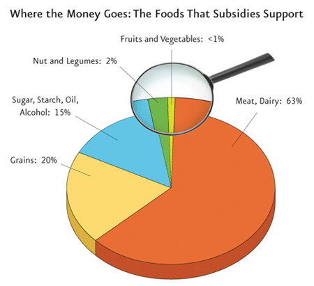
Notice any inconsistencies? On the food plate, veggies and fruits take up half the plate. But in reality, LESS THAN ONE PERCENT of federal food subsidies go to farmers who grow fruits and veggies. Look where the VAST MAJORITY of food subsidies go: to the meat and dairy industry. The USDA is saying, "Do what we say, not what we do." If they really believe that half of the American diet should come from fruits and veggies, it would make sense for them to use taxpayer dollars to promote the production of those foods on a percentage basis.
Finally, here's the best nutritional recommendation graphic of all, produced a couple of years ago by the Physician's Committee for Responsible Medicine. Do you think the USDA borrowed any ideas from PCRM's food plate? You'll notice on PCRM's plate there is (correctly) no "protein" food group. Instead, there is a "legume" quadrant (basically, beans, lentils, etc) which are super high in protein. This is as it should be -- not mixing "foods" with "nutrients" as the USDA plate does. (Thanks to PCRM for the unauthorized use of their image.)
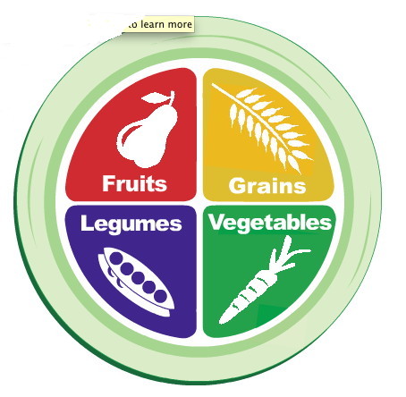
All in all, the most recent USDA plate is a step in the right direction. Thanks to PCRM for setting the standard in simplicity and accuracy so the folks at USDA would have something to go by.


No comments:
Post a Comment